By Dianna Huff
Whenever I’m considering a new business purchase, my standard operating procedure is to research alternative products or solutions online. In fact, I take months to make a decision because I spend the time to evaluate how the new application will fit into my existing processes and integrate with other business apps. I’ve also learned (the hard way) to read review sites for ratings and feedback before making a purchase.
B2B buyers operate in a very similar way. Marketing hype, however, would have us believe that people make spur-of-the-moment decisions. Vendors develop their websites with this expectation in mind – that buyers will come to the website, read a few pages, and presto, will immediately convert by calling, emailing, or signing up for a trial offer or demo.
Thinking through my own research process for the last three applications I’ve purchased – accounting, CRM, and application syncing – I can now see that the vendors I chose all had content-rich websites that supported my research process.
The findings from the annual B2B Web Usability Report – launched in conjunction with my colleagues at KoMarketing – support this thinking. For example, consider what we learned from our 2014 survey:
- 37 percent of survey respondents indicated they’ll visit a website three to five times
- 33 percent of respondents said they do so because they want to research third-party references.
Our 2015 report reflects responses from 262 people, including presidents and CEOs; COO, CFO, CTO, and CMO positions; managers and executives; directors and vice presidents; analysts and specialists; and consultants. Our questions were designed to uncover the factors that cause a buyer to leave a vendor website and perform further research.
What did we discover? The number-one reason B2B buyers leave your site is to evaluate competitive products or solutions.
As you can see in the chart, 87 percent of survey respondents indicated this is why they leave a vendor website and then come back – multiple times.
Whether you’re offering a software app or you’re an industrial manufacturer, you need to create content assets that help buyers through this research process. Here are five elements you need to incorporate into your B2B website to keep buyers engaged.
1) Authentic testimonials – I do appreciate when a company provides extended testimonials that include the person’s name, company name, a photo, and the person’s words just as if he/she were speaking, as you can see in the following PieSync example. Testimonials like this are authentic, which helps build credibility and trust (one of the key research findings for our 2015 survey).
PieSync testimonials
2) Features – Explain to buyers how your product or solution works. Give information about how it syncs with other apps or works on a smartphone. Use lots of screenshots so buyers can see how it works. Let people know the benefits of these features.
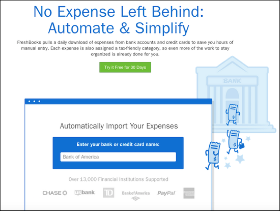
I like how Freshbooks uses whimsical graphics to explain the software features. The whimsy shows that Freshbooks is easy to use and built for small business owners rather than accountants.
Freshbooks illustrated feature
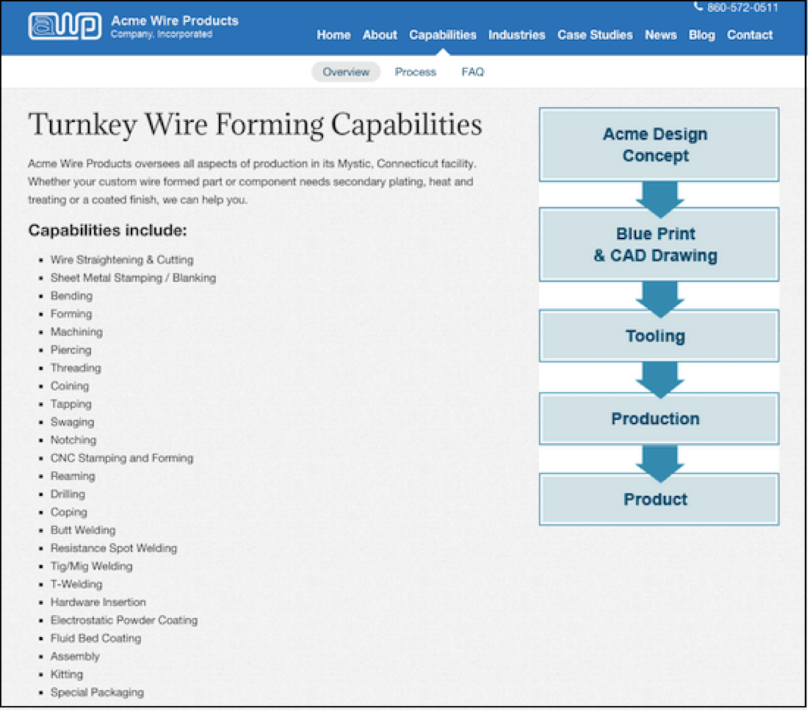
3) Capabilities – If you’re a manufacturer or service provider, help people see the talents, skill sets, and expertise you bring to the table. Use graphs and short paragraphs to explain how these all tie together and how they benefit the prospective buyer. Help buyers understand what makes your company the right choice for them.
In this screenshot, you can see how Acme Wire Products used a graph and text to explain their turnkey wire forming capabilities.
Acme Wire Products capabilities page
4) Ratings – If buyers can rate your product on third-party review sites, list the rating on your website – even if it’s not a 100 percent rating. Most people don’t expect perfection; what they really want to know is that you’re responsive and will help them if they run into a problem. By being honest about your product or service, you’ll build credibility and trust.
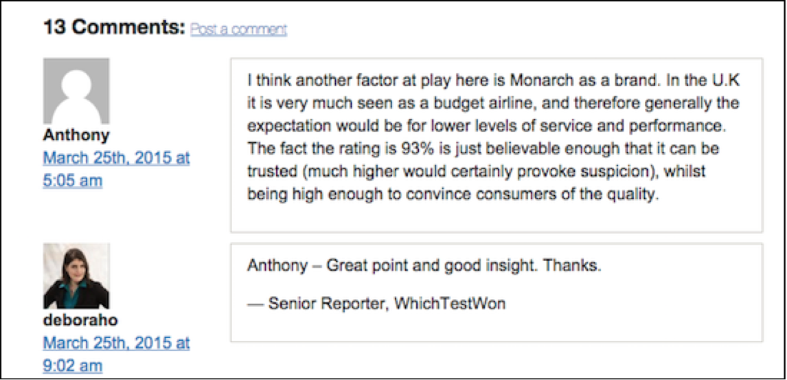
In fact, a WhichTestWon Monarch airlines case study proves this point. SPOILER ALERT! By adding the trust icon, Monarch improved landing page conversions. What I found interesting, however, is Anthony’s comment:
Comment from WhichTestWon case study
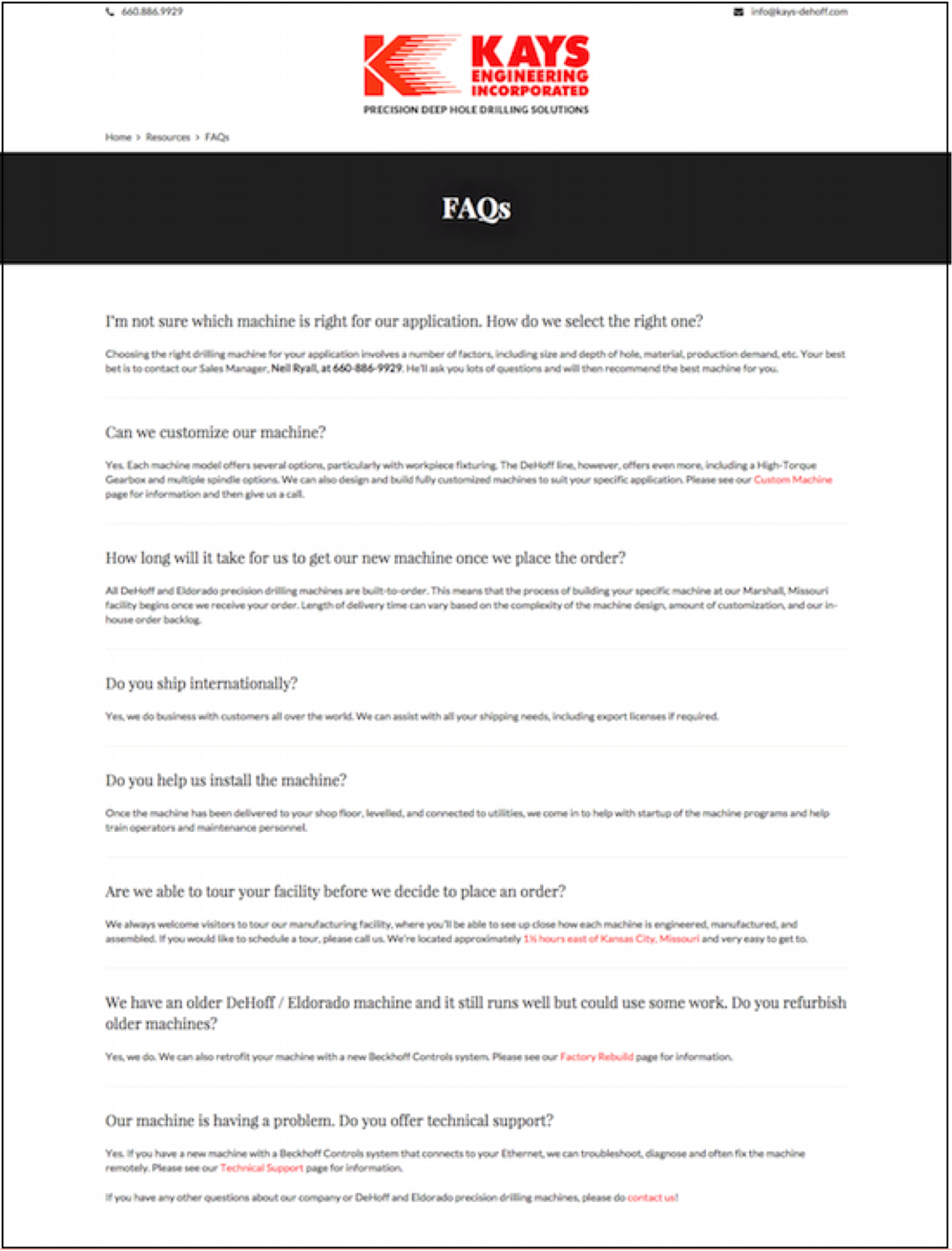
5) FAQs – Before the Internet, prospective buyers would call a company and ask lots of questions to determine if the company could help solve specific challenges. (I know this for a fact because, in the old days, I used to answer four phone lines and had to answer these questions!) Help buyers educate themselves by providing this information on your website and include answers to everything – from how your product works and your business hours to how to receive free samples or move forward with an RFQ.
Here you can see that Kays Engineering, manufacturer of deep hole drilling machines, answers people’s general questions about machine build time, shipping internationally, and technical support.
Kays Engineering FAQ page
These are a few examples of how to help buyers determine if your product or solution is right for them. You’ll find lots of other great research and takeaways from the 2015 B2B Web Usability Report, so be sure to check it out.

Dianna Huff is a marketing consultant for small, family-run industrial manufacturers. She’s also the co-author of 101 Ways to Market Your Website, a guide for small business owners, consultants, freelancers – anyone with a website.
 [Top image via Flickr / Bob Duran]


